Brand design and identity
Canopy of Stars | Sole designer | January - March 2026 | Logo, color system, guidelines
Going into the project
For 5 years now, my wife and I have had an online store under the name "Unleash the Merch!". We felt increasingly uncomfortable with the name and logo, though, and felt it was time for something that represented us better. After thourough brainstorming we landed on rebranding ourselves to "Canopy of Stars".
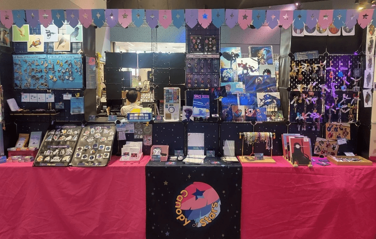
This came with a variety of update needs: a Shopify storefront, in person table setup and social media — while still feeling cohesive. The logo had to work small and large, in colour and in single colour.
Name and concept
Starting with the name, we looked into what it meant for us. Moodboards were made with the sole intention of grasping a better understanding of what we want it to be, how it should feel.


Logo design
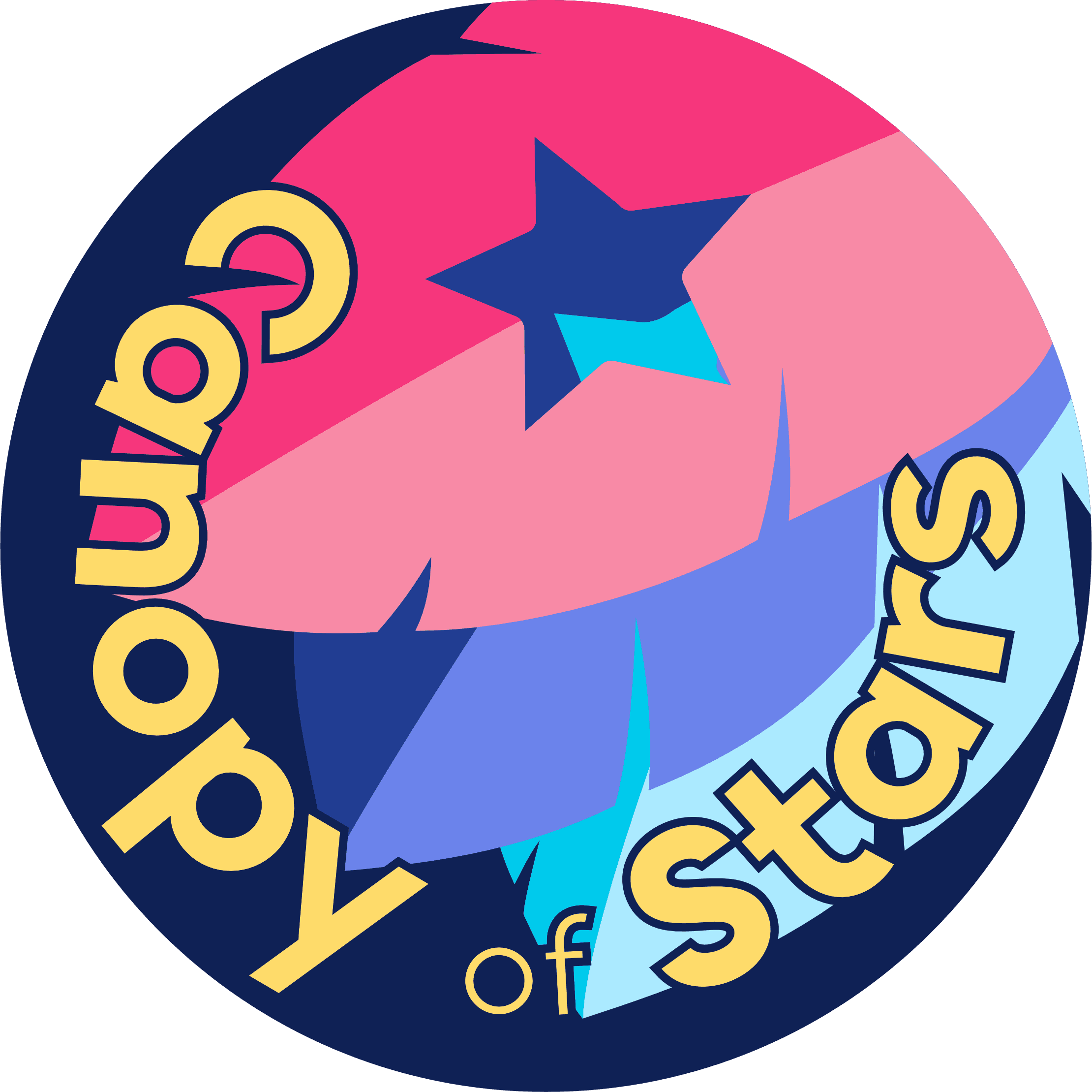
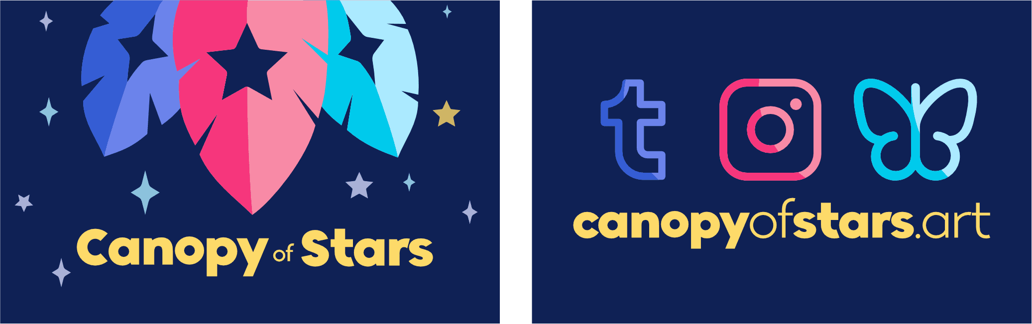
Pretty quickly I settled on leaf forms with star-shaped cutouts, pulling colours from a purple/pink/teal palette. From the start I wanted to have variants of this going more into the canopy look for the leaves for banners or physical decoration for when we are at conventions with a table.
I also wanted a logo that was bold but also felt like an umbrella for all the things we like: nature, space and science fiction.
Color and typography
The palette was based off of our favorite colors and the night sky, giving the entire brand a more dreamy feel that we had laid out in the moodboard.
For typography I stuck with the font Lincoln Road that we had started using under the previous name as it still fits our vibe as well as gives us a bit of recognition back from the previous years.

Results
After adjusting the design system we landed on a cohesive design system that works well digitally, in black and white as well as in real life when we have a table at conventions to sell our goods.